OBJECTIVE
How can I elegantly showcase the 50+ years of work with communities of color and economic reform?
APPROACH
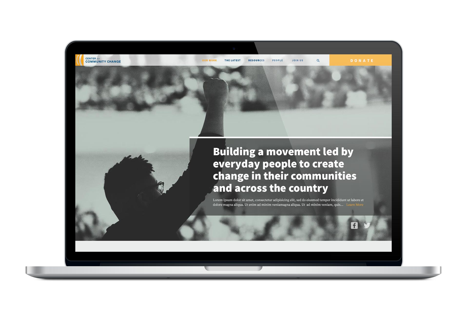
The Center for Community Change has a powerful history with a mission that aims to create lasting change. They wanted a bold, dynamic, visionary, and modern approach.
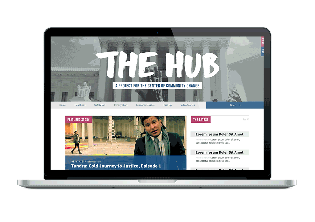
I chose a photography—heavy design that has a monochromatic color effect to emulate snapshots of moments that could change history. They host many events that aim to make political change so I felt that those events should be at the center of attention. The photographs of the very work that the organization does will be the best way to show the audience the impact CCC can make.
CATEGORIES
Branding
Web Design
Print Design
TYPEFACES
Source Sans Pro
Source Serif Pro
DELIVERBALES
Website
Multi-page document


The color palette provides contrast to aid the CCC orange to stand out.

Each section had to be on brand, but still distinct from the other sections.
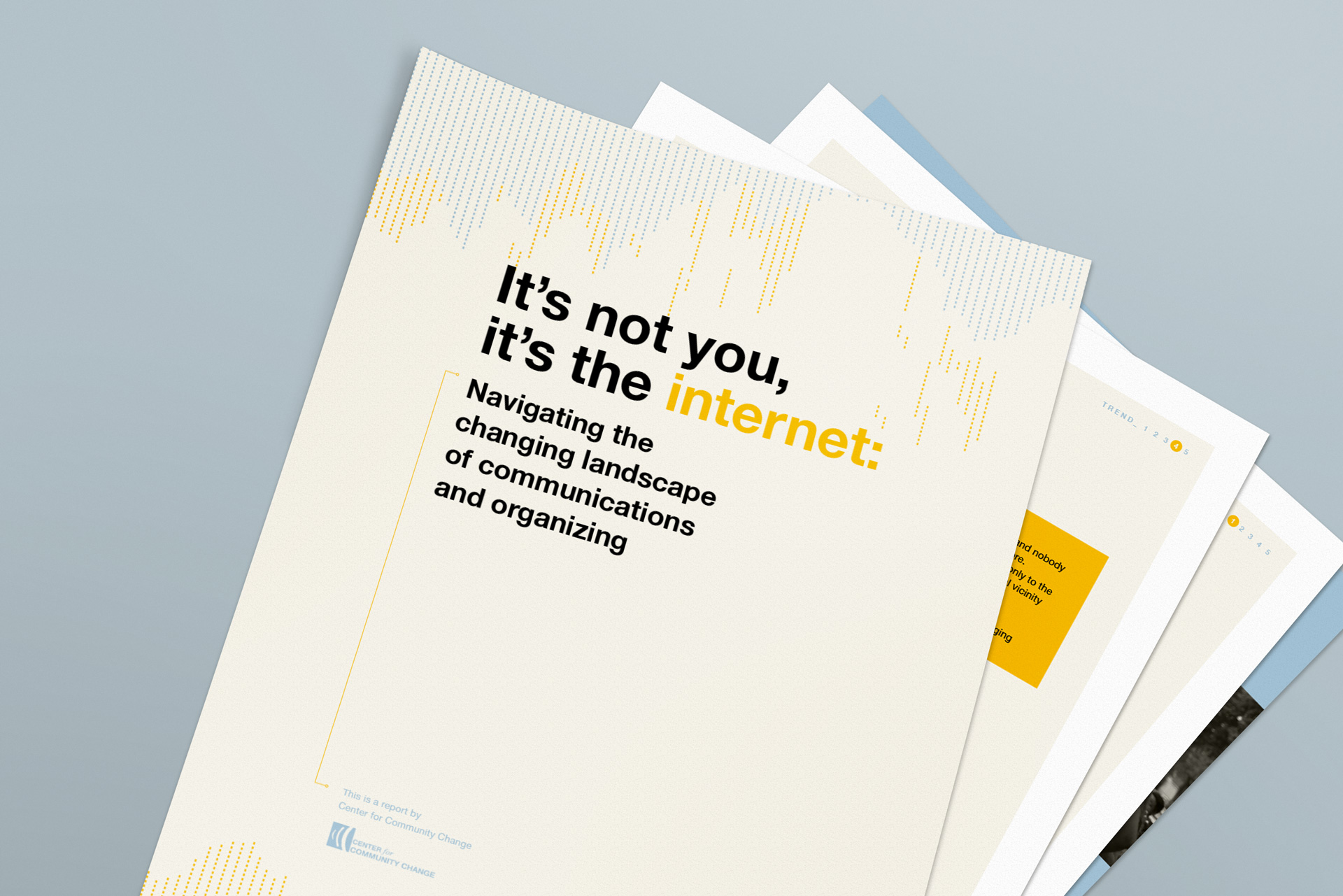
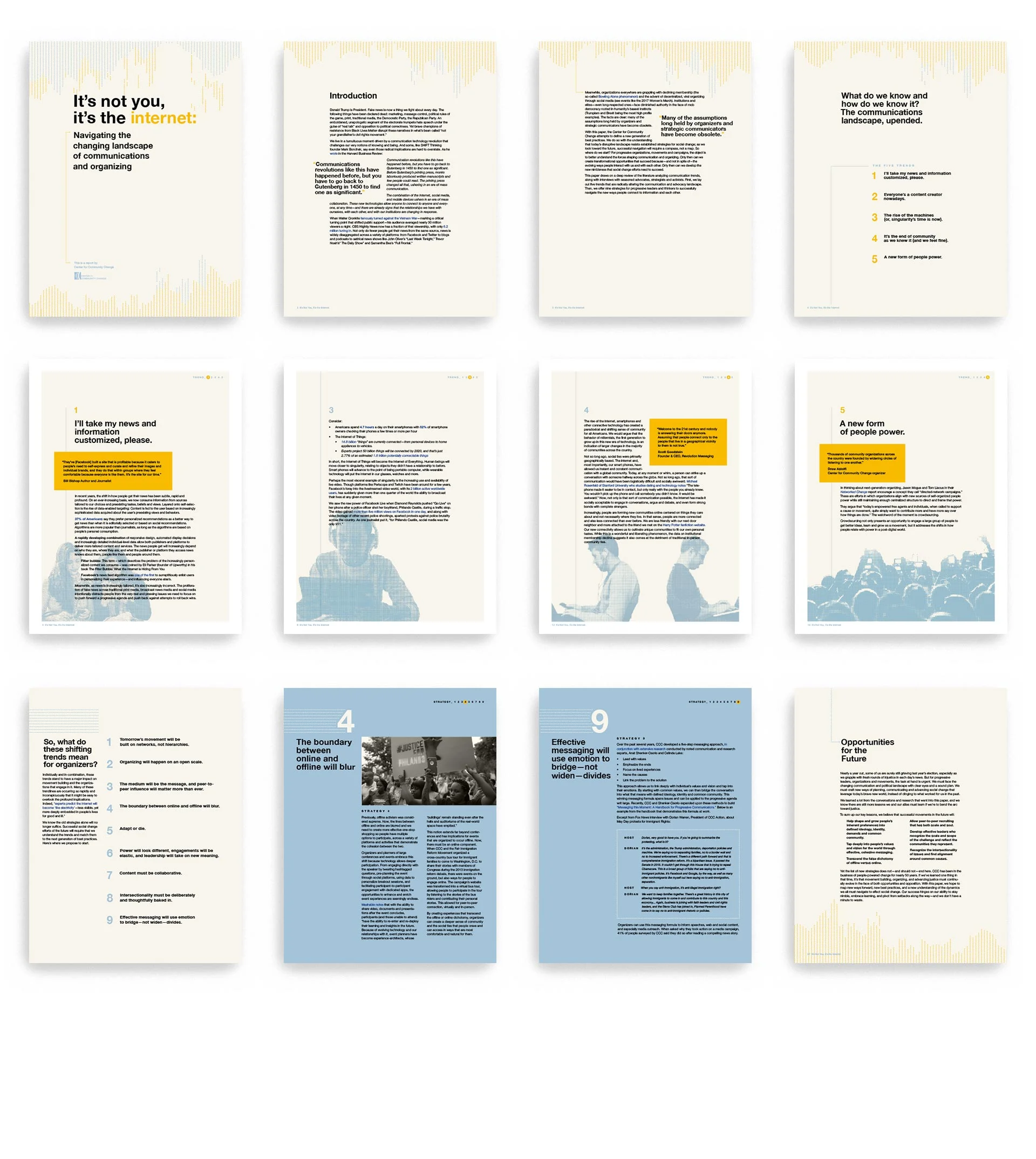
OBJECTIVE
How can a research document be clear and interesting?
APPROACH
Using a modern Swiss grid, the document will be clear and understandable. A thin neutral sans-serif typeface appeals to a broad audience and alludes to the digital space along with the elements of lines and dots. The blue symbolizes the content of the research, social media, along with the CCC orange as a sign of activism.